I'm amazed that Google's actually managed to fool anyone into believing they really did design Google Metro I mean *cough* "Material Design".
Hell, I'm amazed they even choose to swipe it in the first place: The biggest visual abomination to hit computing devices since Windows 2, attached to the biggest operating system blunder since...well, since the last Microsoft operating system blunder, Vista, and some Google genius decides, "Yes, this is a great thing for us to imitate."
As if stealing Metro wasn't insane enough, they just had omit the one good thing Metro actually does have going for it: Actual...fucking...words right below all the nonsensical hieroglyphs. (Even Chinese/Japanese logographic writing occasionally has such a thing as "Ruby/Furigana". And those are for long-established symbols, not some vague squiggly metaphor pulled out of a random cubicle-dwelling technohipster's ass one afternoon.)
Seriously Google, if I wanted my phone to look like Windows Phone Unicorn-Vomit Edition, I'd get a Windows phone. At least then I could actually read all the meaningless idiotically-designed buttons.
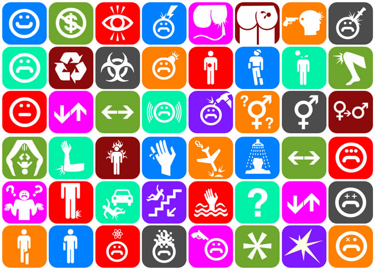
Remember this computer "interface" from Idiocracy?

We've already shot beyond that, with hieroglyphs that make far less sense, and screwups like Google have been leading the charge.
Oh well, I shouldn't complain. At least it's not an iPhone.
0 comments for "Material Design Makes Me Want a Windows Phone"
There are currently no comments.